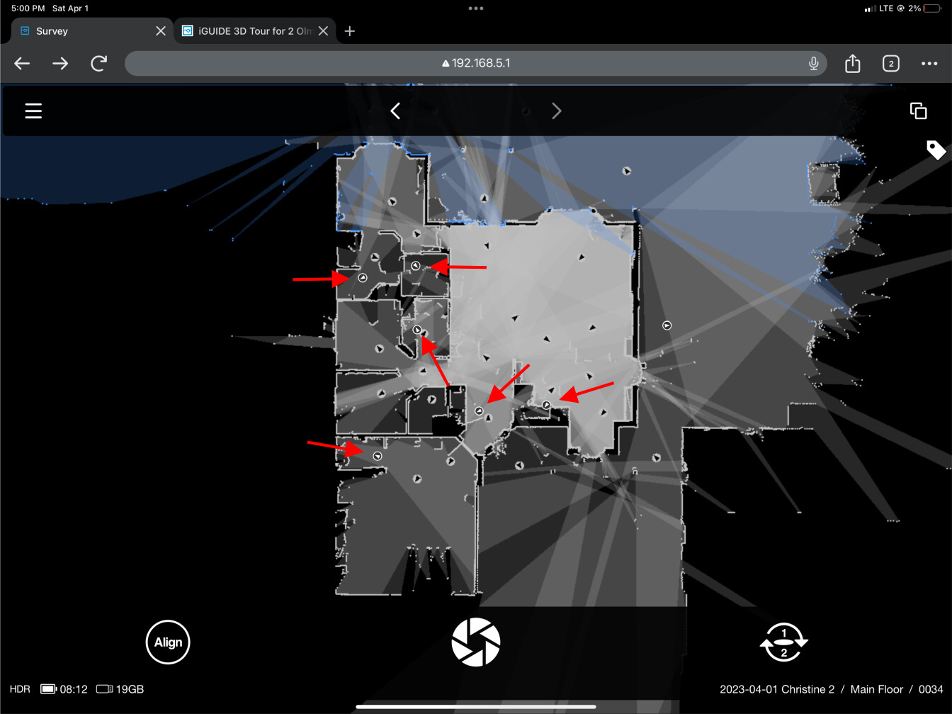
Can we please have a visual indicator in Survey for hidden panos? While it’s great that we can hide panos onsite, it’s frustrating to not be able to immediately see which ones are hidden.
It could be as simple as inverting the color scheme for hidden panos like this mockup. (The red arrows are for emphasis.)
That’s been an option for as long as I can remember, but the option was hidden away until recent updates.
I find it much easier to hide panos while onsite, so you don’t have to think about it again later. Since it’s easy to get distracted (e.g. phone buzzing, sellers scooting around, mindless daydreaming…), having visual indicators to show what’s what would be very useful.
Totally agree! A visual indicator for hidden panoramas would be a handy addition, and the proposed color inversion in the mockup seems like a simple and effective solution.
Red is generally used to present crucial information, like an error or other showstopper. I think that’s too loud as an indicator that a pano is hidden.
But I’m splitting hairs here. The point is that it would be helpful to be able to see hidden panos in an unobtrusive way.
I would agree with the alternate color for hidden panos.
I would also love to have a button somewhere on the survey interface to hide/unhide a pano. Right now it’s cumbersome to hide a pano while working through a property. Think like the add tag icon on the survey window.
I would also love to have a button somewhere on the survey interface to hide/unhide a pano. Right now it’s cumbersome to hide a pano while working through a property.
Yep, that would be good too. I made a few UI suggestions that would benefit those of us using larger devices like iPads at Survey Suggestions.