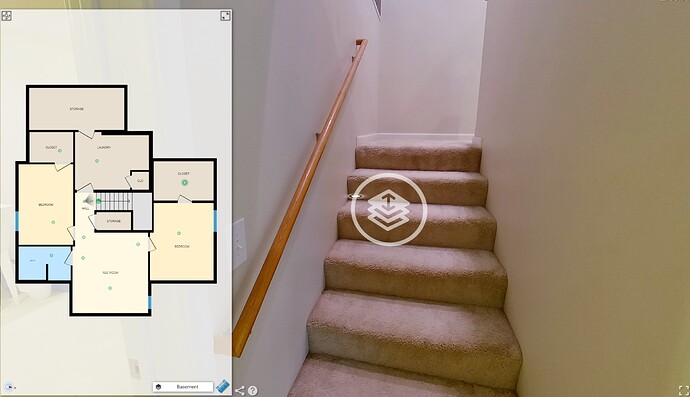
I have found on multiple iguides that the white circles on the ground for navigation are often shown thrown a wall or multiple walls.
Can we have the option to adjust this?
I’ve attached an example where one can see that the closet a few wall away can be seen and selected/highlighted. This is possibly confusing for viewers and I also feel it looks unprofessional.
Thanks.
