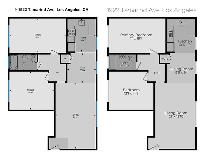
We work in the Los Angeles real estate market, and when I’ve used the i-guide to produce plans I either get complaints from agents, or am asked to redraw them. Every aspect of the i-guide product is well thought out, but the floor plan is an aesthetic marketing tool and a graphic designer needed to be hired for these. They suffice for leases and fixers, but don’t cut it for million dollar listings. What we draw from scratch (www.PlanlabLA.com) or even what CubiCasa produces (we’d prefer to use them if we could trust the accuracy) are much cleaner. But we are stuck with these floor plans when agents want 3d tours, and we had hoped to be able to use the scans to produce plans when we don’t have time to measure and draw them ourselves. Let me know if any of you have come across questions or complaints on these fronts, but here is what I would improve:
- The font for labels need to be nicer and large, Arial is too basic.
- The arrows are unnecessary to represent the area of a space, and along with the color change in door thresholds, keep the plan from looking “clean” or “easy to read”. An option to remove these would be great.
- A huge issue is the doors are drawn at .75" thick if you open the dxf files, and thus read as just a line on the floor plans. Especially since the window panes are two lines, it looks like the windows are thicker than the doors. If doors are drawn at 1.5" they would look MUCH nicer on the plans.
- The blocks used as fixtures could be simpler and nicer. Picking out nicer blocks and providing the draftsmen with these is an easy upgrade.
- An option for white windows instead of blue would be nicer, too.
Are there any other things you can think of that would improve the plans? The floor plans by i-guide could be a selling point instead of an after thought. In our business it’s holding us back. Here is a simple, side by side clean up I had done to show what they can be like, but again the CubiCasa options would also be a good start.
