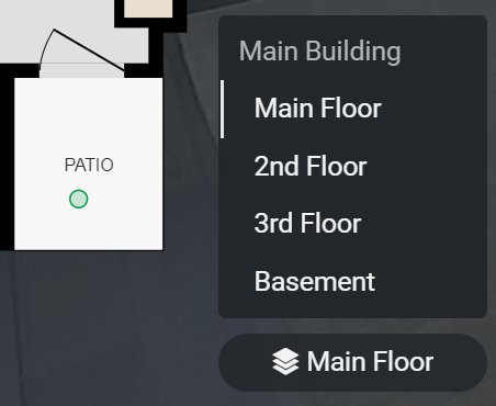
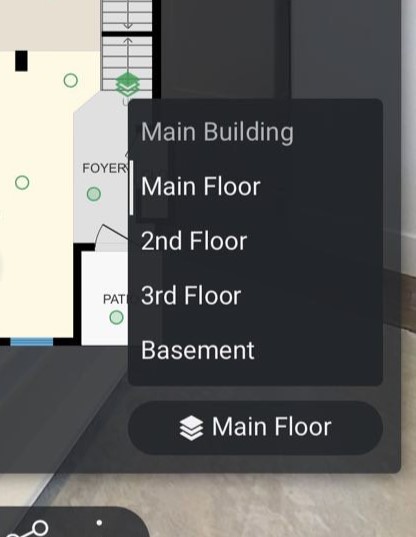
Can you please tweak the floor/building selector on mobile devices to make it more legible, like it is on larger devices?
On a computer/tablet browser the floors are slightly indented making it clear what’s a building and what’s a floor.

On mobile devices, it’s all left-aligned which makes it confusing. I don’t have a good example with multiple buildings to show, but when there are multiple buildings it’s not immediately clear what’s a building and what’s a floor. (Aside from a slight difference in the font color.)
Thanks.
