I know this comes up not-infrequently as a topic for iGuide operators, but I thought I would bring this up again because it came up with an important client. Their seller was bothered by two things:
-
One of the navigation circles (not pictured in the screenshot) would take the viewer through TWO sets of stairs to leap to a hallway that is not just an adjacent wall. That’s awkward.
-
Another navigation circle is inside the floor selector, which is awkward and borderline unnavigable. It takes effort to click the right function.
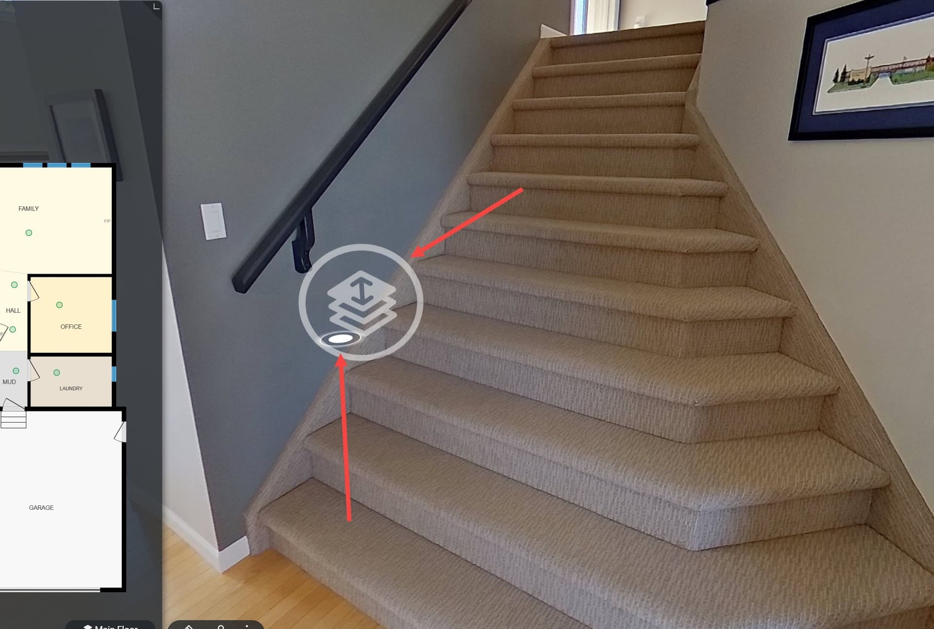
I was told by support that neither of this issues could be addressed.
If the drafters can’t change that (and I can’t imagine why they can’t), why couldn’t the floor selection position be adjusted by operators? As it is far off to the side it’s inelegant and impedes with navigation. Why wouldn’t the floor selector be centred on the stairs, which is where anyone would expect it?
Some of these navigation details need to be refined to provide a smoother experience for people viewing iGuides.