In the past, we have been editing all our iGuide floor plans to show room names as “Bedroom” rather than “BEDROOM”. We do this because all caps are harder to read since the eye cannot distinguish as easily BETWEEN DIFFERENT WORDS WHEN EVERY LETTER IS THE SAME HEIGHT. It simply looks more professional and less like a robot. A new updated happened that does not allow this to be edited in the iGuide editor. Am I the only one upset?
Myself, my team, and 99% of our clients like the all caps. It’s spaced out per room, and is much more legible when viewing the actual tours on a cell phone which most people do these day. And you can still go in and change it if you want…
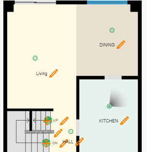
Matthew, thank you for the feedback. You can change font on the tour, but when you download the printed floor plan you still have to edit the pdf, jpg, or vector image. I’m talking about the printed floor plan. Did 99% of your clients take a poll showing they prefer one over the other or is that just assumed. We offer other floor plan services and when we first started offering iGuide we did not edit the all caps. Then our clients started asking often if we could make the caps like our other sketches. We then took that feedback and started editing.
1 Like
You have to remember ALL CAPS is rooted in architectural practice because the letters forms are the least likely to be miss read when the paper is wet from rain drops or spilt coffee. Especially when two letter abbreviations are used. Try printing the following letters on paper, rpqes and then drip water on it.
Try is with all caps RPQES
Everything is done for a purpose…
1 Like